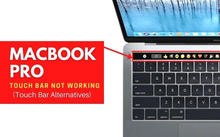
When Apple unveiled the MacBook Pro in October 2016, they were sure to highlight their new Touch Bar. This is a strip of touch-sensitive keys that replaces the function keys at the top of your keyboard.
The main thing about this innovation is that it’s not just for show – it actually has a use! It can perform tasks like volume control or switching apps within a folder. But what went wrong with the MacBook’s touch bar?
The answer lies in its purpose and design. For starters, there are no visual cues on how to use it without going into each individual app and figuring out how to navigate through menus using only gestures.
We discovered that Apple’s engineers overlooked some key considerations in the development process and didn’t anticipate how they would affect users’ workflows. In this article, we will explore what went wrong with the MacBook’s touch bar.
The Touch Bar on Apple’s MacBook

Since their introduction, the Touch Bar on Apple’s MacBook Pros has been a bit of a hard sell. They’re too inconsistent to be as great as some had hoped – and others just made fun of them from the start. What went wrong? It’s important to take a look at what happened!
Apple introduced its entry-level 13-inch Retina MacBook Pro (for $1,299) with an OLED touch panel in place of traditional F-keys in late 2016. The company argued this new feature would allow for contextual controls appropriate to specific apps, depending on the context, like changing track volume or increasing the font size.
It didn’t take long before the internet made fun of it. For a “Retina” display, users seemed to complain. Why were the icons on the Touch Bar so small? What’s more: What horrendous color choices! Apple surely messed up there.
Did the Apple Developers Complicate Things? What Went Wrong
For Apple itself, though, things got complicated when developers seemed slow to adopt the idea. Even if Google Docs has an icon for bold text, not every app will let you use it with your keyboard.
And then there was also this problem that no one really talked about at first: What happens when this thing fails catastrophically and doesn’t work anymore? What would you do without F-keys? Even if you could get used to the Touch Bar, that would still be a problem. What could Apple have done about all of that?
Why Wasn’t the Touch Bar More Popular
Most people are eager to know the reason the MacBook touch bar wasn’t popular. Well, Apple designed the MacBook touch bar to offer a comprehensive and advanced input method.
What we’re seeing is nothing more than another attempt at trying to bring the touch experience to laptops without taking up too much space by integrating it into the function key strip.
What’s not known, though, is that this concept has been around for a long period but failed miserably because there were several issues, such as accuracy, reliability, and battery life, which proved to be a problem in most cases.
Apple really didn’t do that great of a job with the implementation either and it always seemed like they weren’t all too thrilled about making it happen even though they initially thought it is an amazing idea. It seems like they didn’t pay attention to the needs of their consumers and instead made it all about themselves.
This is one of the biggest problems with Apple because no matter how much they try, they still can’t seem to fix this problem. What’s worse is that many people were waiting for something great like Siri integration, which would make things easier but got things like picture-in-picture video, which isn’t even that useful in most cases. That’s why the MacBook touch bar wasn’t popular.
Why Did Apple Seem to Abandon the MacBook Touch Bar Almost Immediately
Since its launch in late 2016, they have received the MacBook Pro with Touch Bar. Apart from a few spec-bumping updates, Apple has done little to keep the Touch Bar.
In June 2017, Apple gave the MacBook Pro with Touch Bar a spec bump to Kaby. Its stock configuration is pretty much identical to that of Apple’s late 2016 model, with only being a slight bump in storage from 128 GB to 256 GB.
At the time of the spec bump, Apple would not release another MacBook Pro until 2018. This alone might have been enough for some people. But there are many who have the spec bump, saying that Apple should have made more significant changes.
The Touch Bar appears to be a completely new laptop, with barely any. While Apple released a new version of its MacBook Pros, this fell short of people’s expectations.
After the spec bump, there was much speculation about whether Apple would get a functional Touch Bar. The community had mixed responses to this, with some thinking that it would be getting. Others were less optimistic, saying that the Touch Bar had been a failure for Apple. Since the MacBook touch bar didn’t meet customers’ expectations and the company didn’t want to use more resources on it, they had to abandon this project almost immediately!
F-Keys Are a Bit Old-Fashioned
The touch bar of the new MacBook Pro, which replaces the traditional function keys with a touch-sensitive OLED strip, is taking a lot of flak from users. Most people find it difficult, and it’s not just because they aren’t sure what the function keys do. The function keys were always really laborious to use. You had to hold down the key and then hit the function key, one by one.
For a Mac user, this was just an inconvenience, but for a PC user, this was an insurmountable barrier. So, while users have been mocking the iPhone’s lack of a physical keyboard, I’ve been laughing as PC users struggle to use Apple’s (faulty) transition tool.
What Alternatives Are There For That Top Row?
The function keys weren’t really that good, but there has to be something better than the Touch Bar., what if the touch bar was a bit older-fashioned? Here are some modern alternatives to the Touch Bar’s ancient predecessors.
- The Apple Watch ‘crown’: By pressing this button, you can scroll up and down, which is perfect for moving through menus.
- The joystick: This is the most versatile option. The joystick can get used to selecting anything, and it isn’t ambiguous.
- The mouse: Pressing buttons on the mouse, which is a lot less confusing than the touch bar.
- The volume slider on your headphones: You can’t accidentally press, and it’s not ambiguous.
- The mouse scroll wheel: The slightly less-modern ‘up’ and ‘down’ buttons on your Apple device. They’re familiar, and there’s no way to press them unintentionally.
- The Windows key: Although this is technically a button, it’s easier to press than the physical buttons on your keyboard., this button has been tested and is plausible.
How Could Apple Have Improved the Touch Bar
Apple is a company that is well known for its gadgets. Their most recent innovative product, the, is no exception. Along with its sleek modern look, the Touch Bar has many prominent features, including shortcuts, trackpad gestures, and the ability to change screen brightness.
Most people know the MacBook touch bar is not perfect. Here, we will present 3 things Apple should improve to make the touch bar even better.
Apple Should Add More Advanced Customization Options
Right now, users have the simple option to select from a list of shortcuts they want to use. For example, if you wanted to switch between apps, you could select the taskbar app icon. If you wanted to switch apps using the keyboard, you can use Mission Control shortcuts.
Apple Should Add the Ability to Customize the Bar Using Apps
For, if you want to highlight specific colors in photoshop, the touch bar would be great. If you wanted to open your favorite websites, the touch bar would be perfect.
Apple Should Allow Users to Create Their Own Touch
There are already tons of customizable apps for the, like Lightbar. These apps show that there is a demand for customizable touch bars. If Apple allows creating, they will have increased customer satisfaction.


